Here, unlike in . . . Venice (1) below, I have no hesitation in preferring the colour images.
In the top picture, taken by a friend, I like not only the waterside composition and the almost mystic quality of the grey light, but I enjoy and appreciate the way my eye is taken from the pink Campari on the grey metallic table to the red writing on the serviette holder and then across the olive green water to the emblems on the ship's red flag.
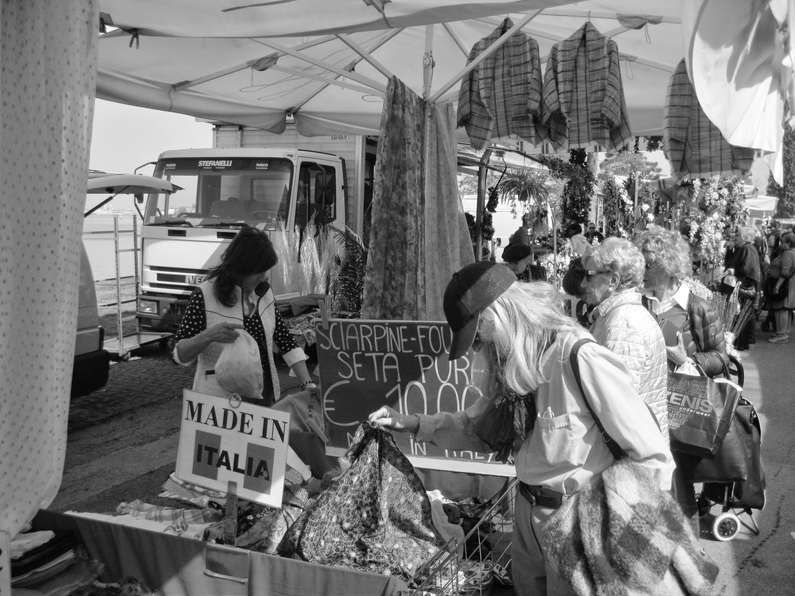
The result of changing from colour to black and white in the bottom photo is a complete disaster. It fails to capture anything of the excitement of the colourful weekly street market on the Lido.


top: An aperitif on the Zattere, Venice
bottom: Weekly market at the Lido, Venice
Venice - was my favourite city in the whole world until everyone began to go there Gwil. Campari - my favourite drink too. Agree about that pink in the top photo.
ReplyDeleteSadly Venice is getting more like a theme park year on year. Most of the little corner shops like the butchers, fishmongers, cobblers (where I often took a pair of shoes to be soled or heeled) are gone or going and giving way to souvenir and trinket shops. A lot of locals are moving out. If they ever close the university that will be the end of the end of the place.
ReplyDeleteYes, I agree the colour ones are best here. Interesting experiment.
ReplyDelete